I’m often asked who my biggest influences in the art world are, and who MY favorite artists are as an artist myself. The earliest piece of historical art I remember being drawn to is Starry Night by Vincent Van Gogh. A representation of this piece was printed on the windows of my elementary school’s library. I also have a vivid memory of looking at large posters of his work during “Picture Parent” day in 2nd or 3rd grade, where parents of kids in class would volunteer to give a little art history lesson once a month. We talked about his time painting in France, and got to eat Brie cheese because, France. I think the snack helped make it particularly memorable.
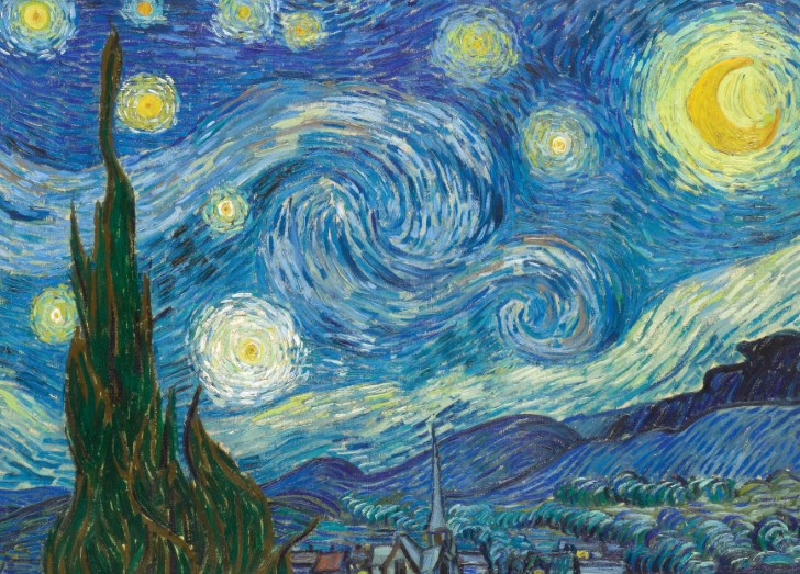
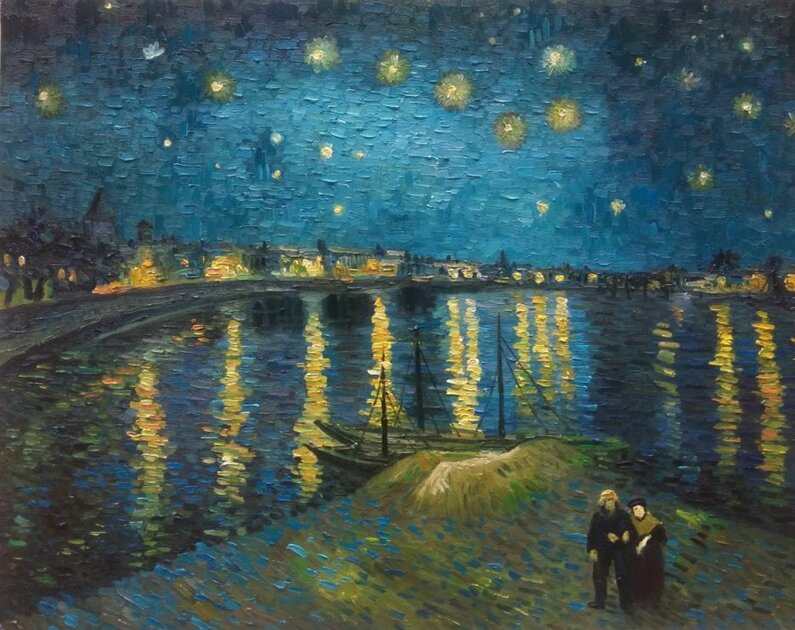
As I got older, I became more interested in meticulously detailed, mechanically tight artwork rather than impressionism, but I could still be grabbed by Van Gogh’s unusual use of color and pattern. To this day, I myself tend to use non-typical colors that are a bit off, but in a good way (or so it has been described by others). Many say Van Gogh’s art is only interesting because of his story, and that may be true but I think that’s ok because artists’ stories inevitably end up woven into their art. They cannot be separated. Reading his letters to his brother and his thoughts on faith, art, friendship, and the world surrounding all while struggling with various (back then untreatable) disabilities have certainly added to my appreciation of his art as I’ve grown older. Reportedly, there is a story where Van Gogh was talking to a clergy (He was quite religious and considered going into ministry, but his unpredictable temperament was a barrier.). The clergy asked, “How can you say God gave you the spiritual gift of art, when well … your paintings aren’t very good? Maybe you should try something else.” Van Gogh replied, “Maybe I’m painting for people who aren’t born yet?” Artists follow our path, even when it doesn’t look like it makes sense. As someone who feels a deep sense of purpose in what I do including my teaching, this resonates.
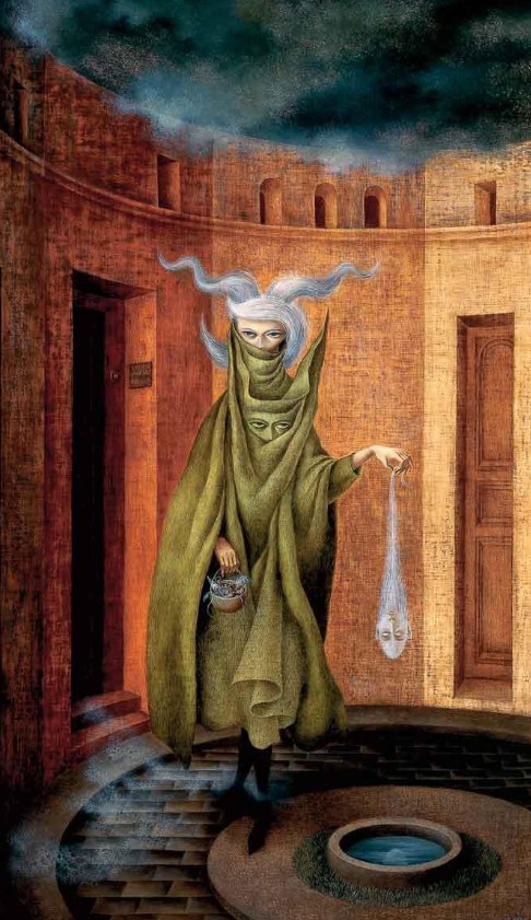
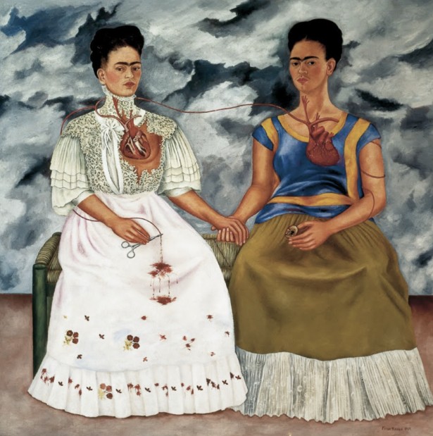
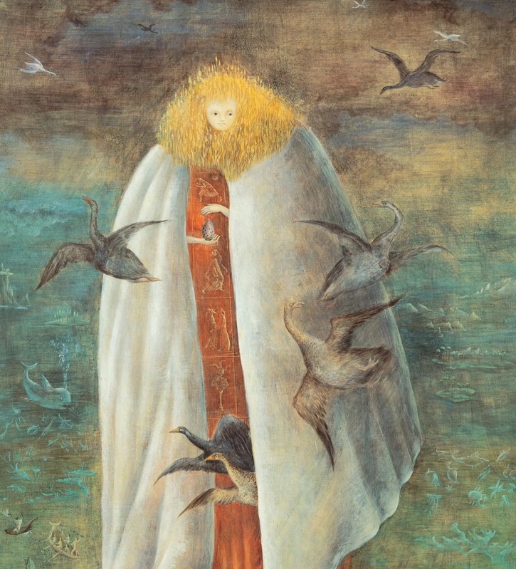
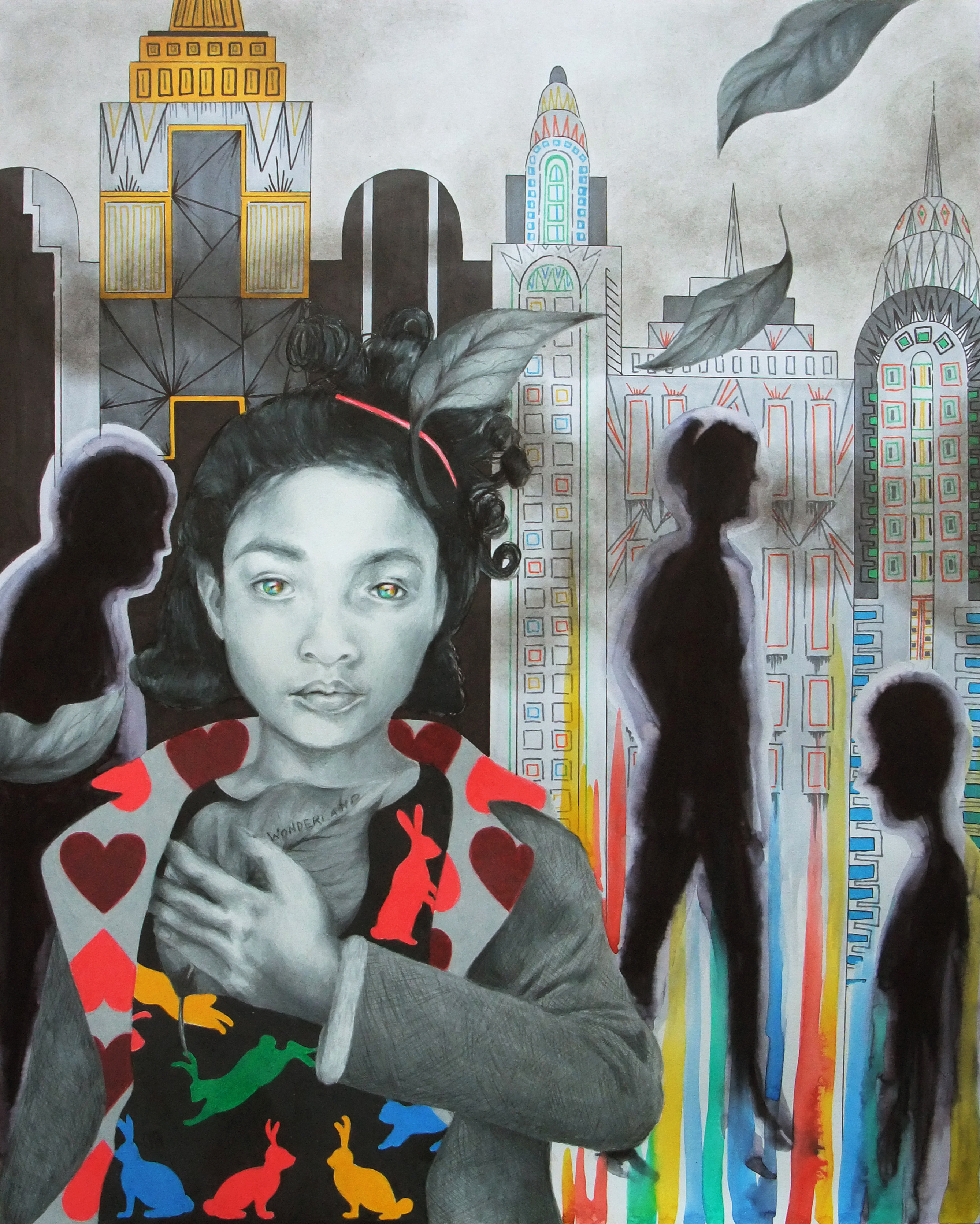
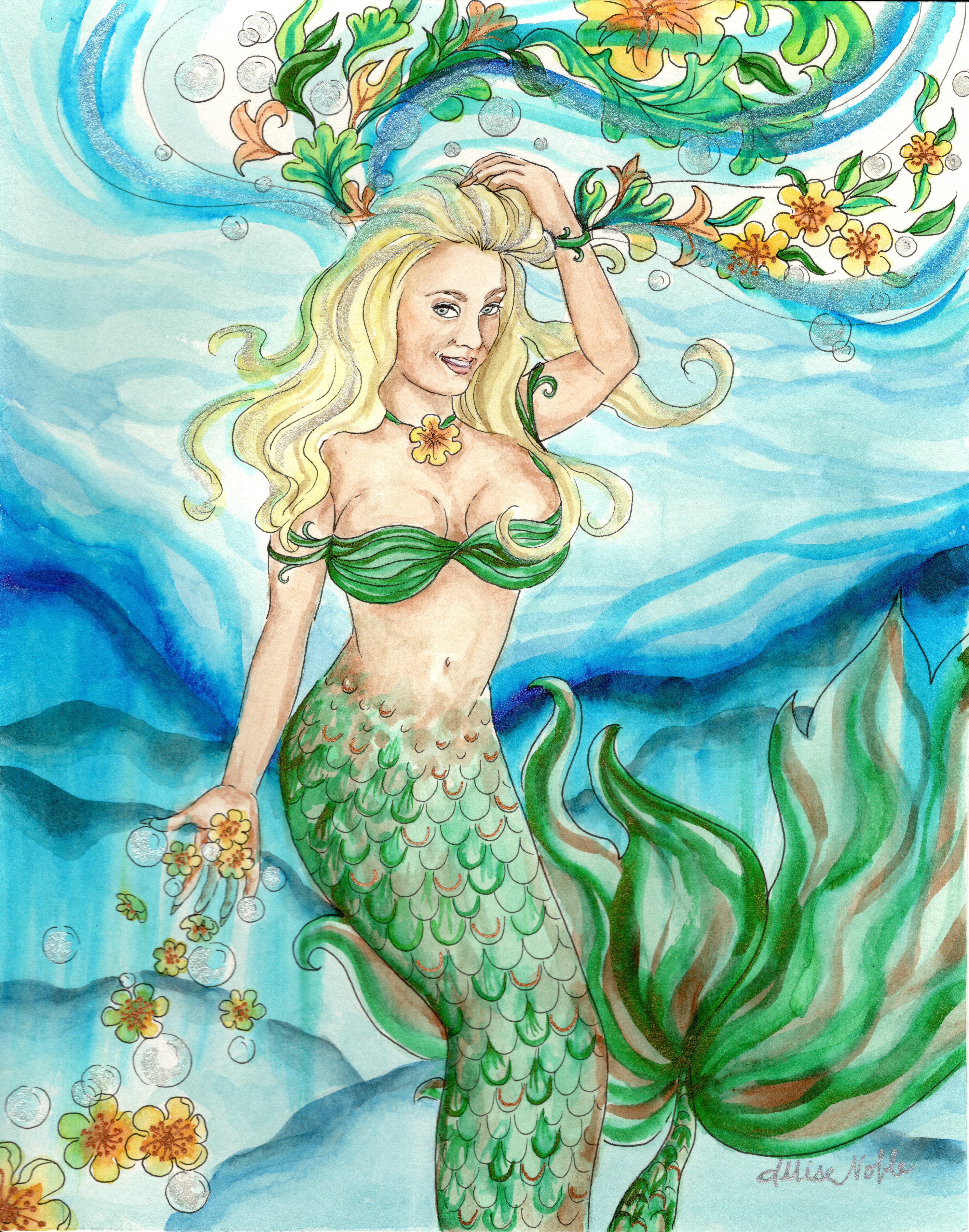
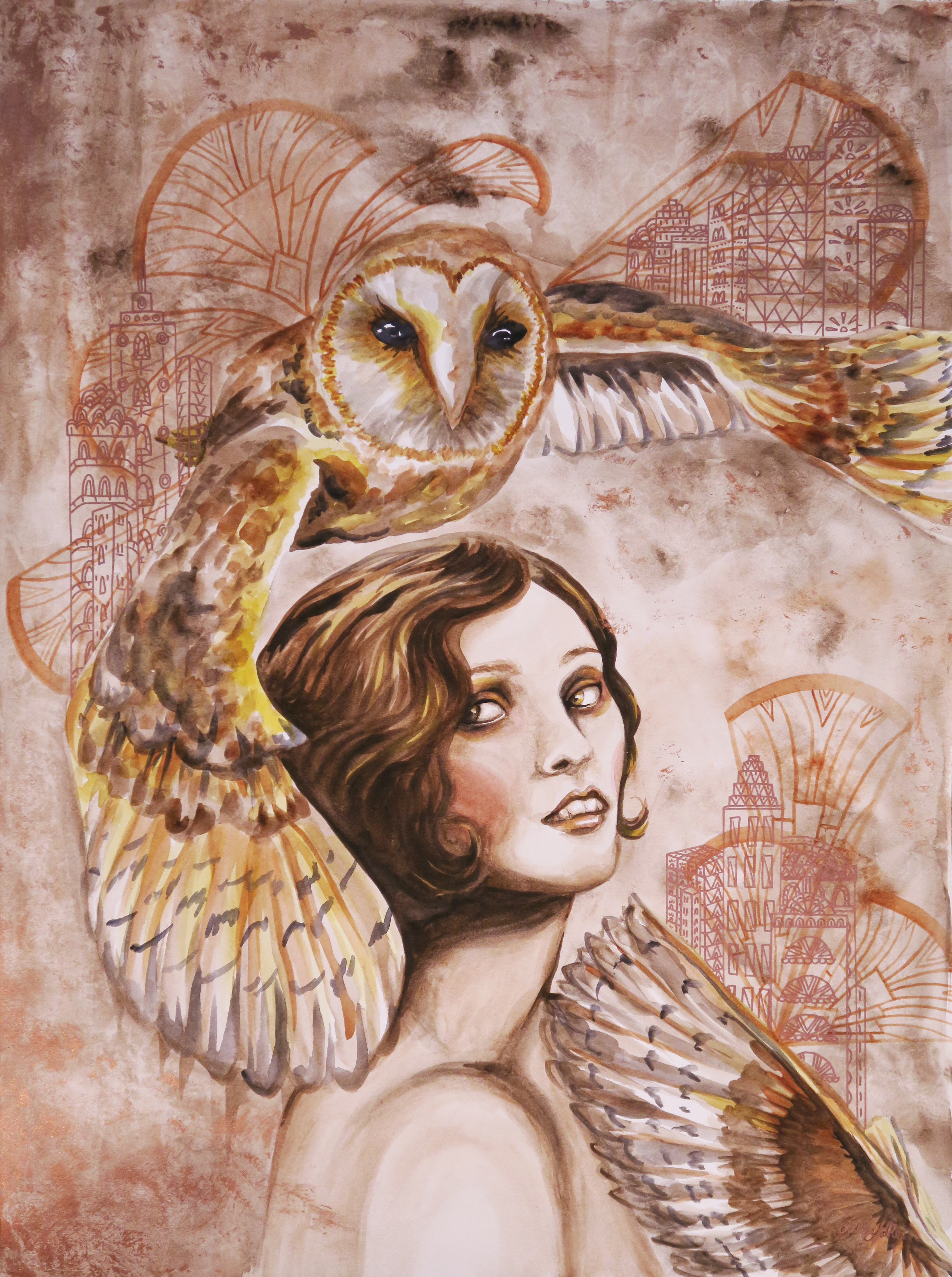
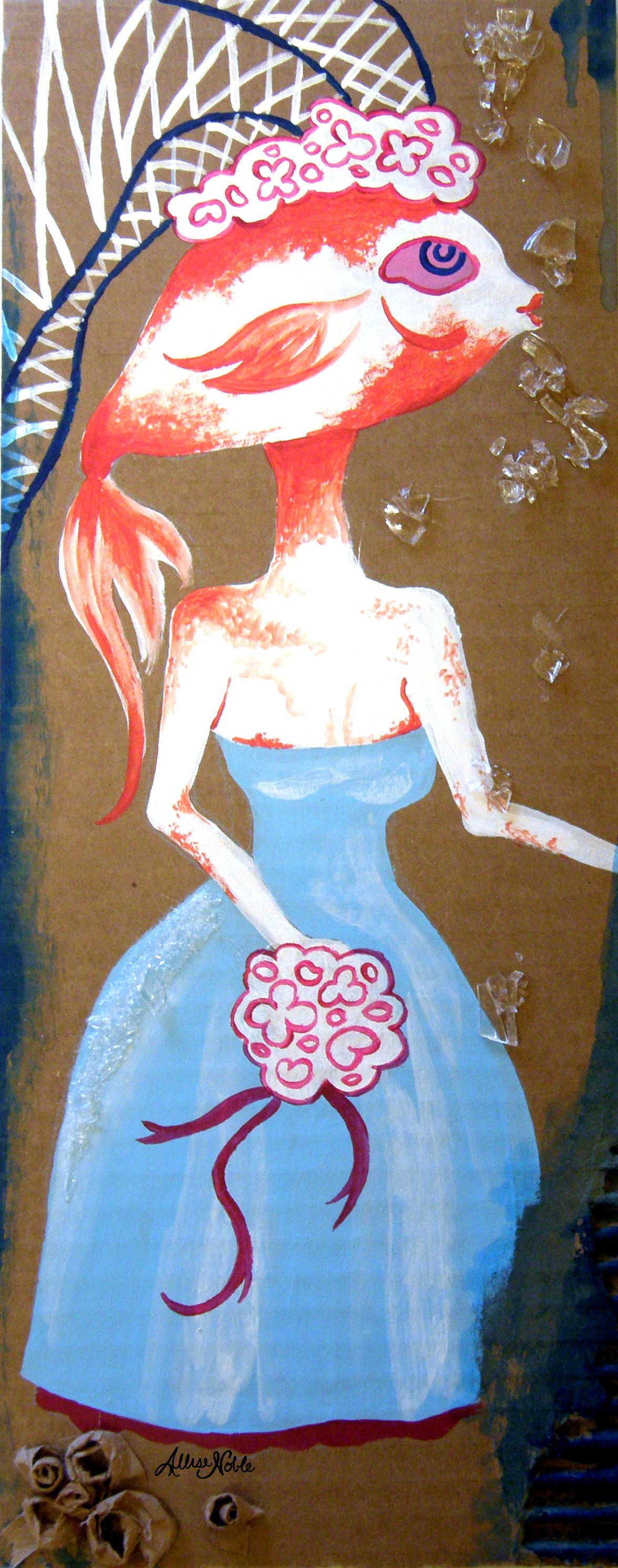
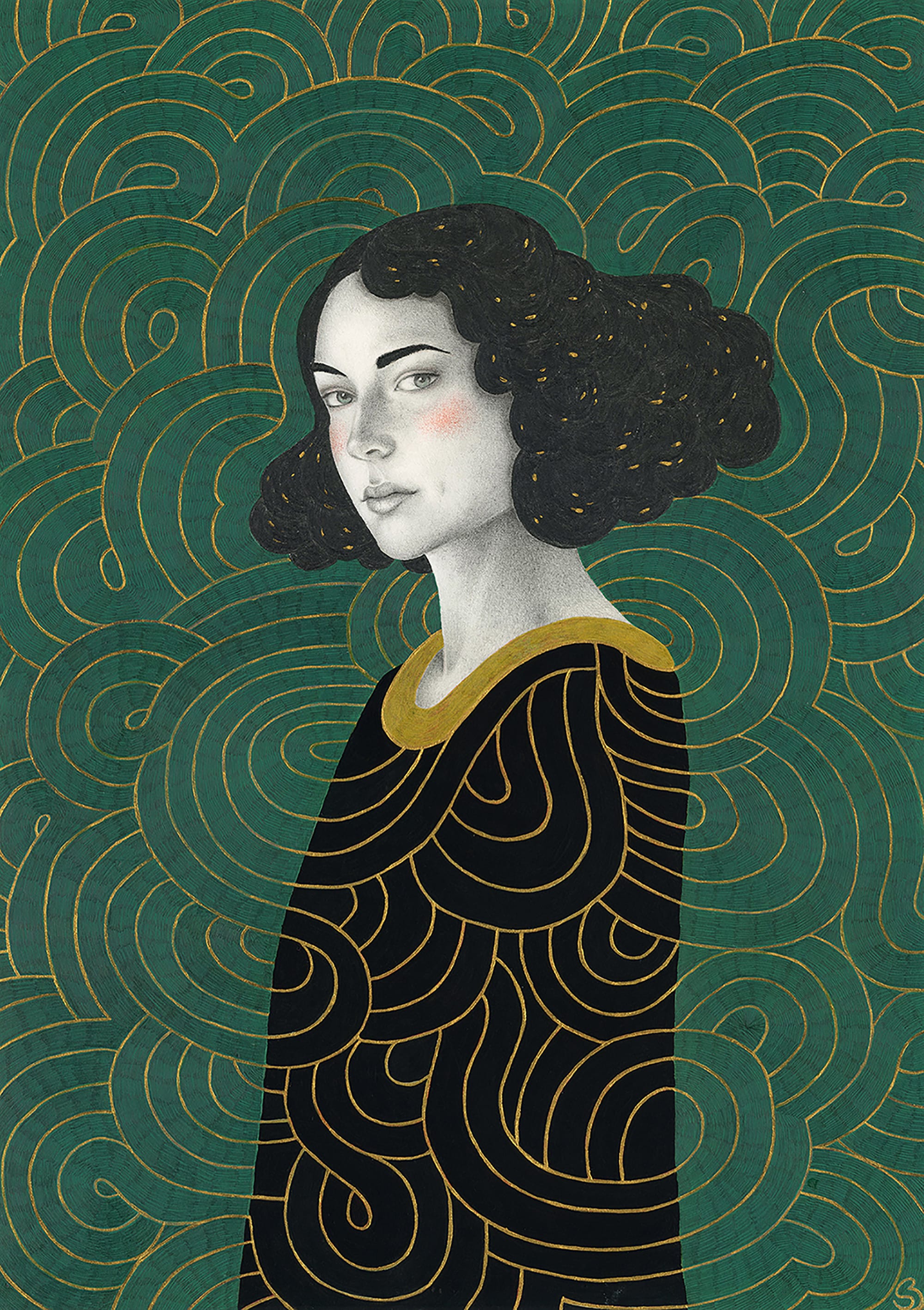
The surreal work of women like Frida Kahlo, Leonora Carrington, and Remedios Varo are more favorites from history. I describe most of the work I do as “surreal portraiture”.
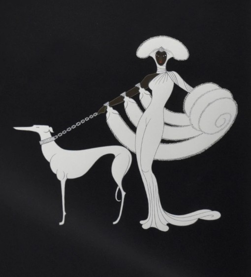
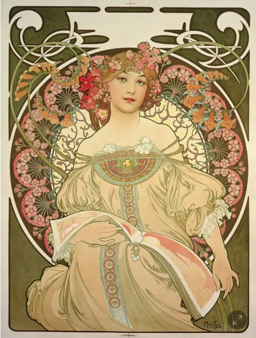
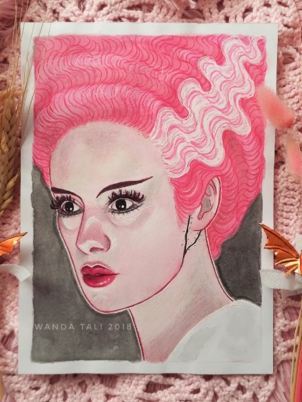
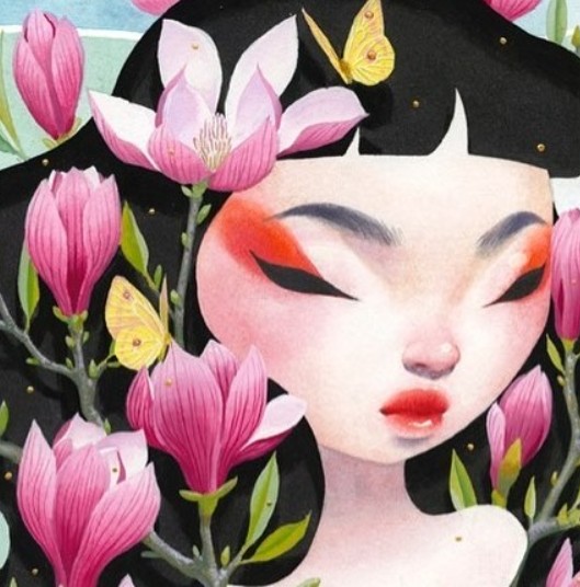
Modern day favorite artists are so many, especially with easy access to images on demand: Sofia Bonati, James Jean, Bao Pham, Wanda Tali to name a few… Art involving people and faces is always what stands out to me first, ever since I discovered Mucha and Erte from looking through art calendars in Barnes and Noble as a teen, my go to hangout spot in a town without much to do back then.
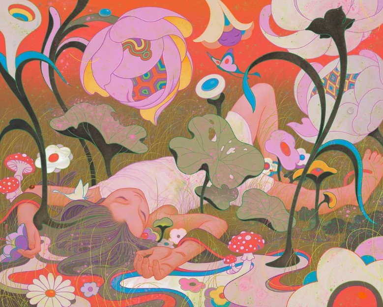
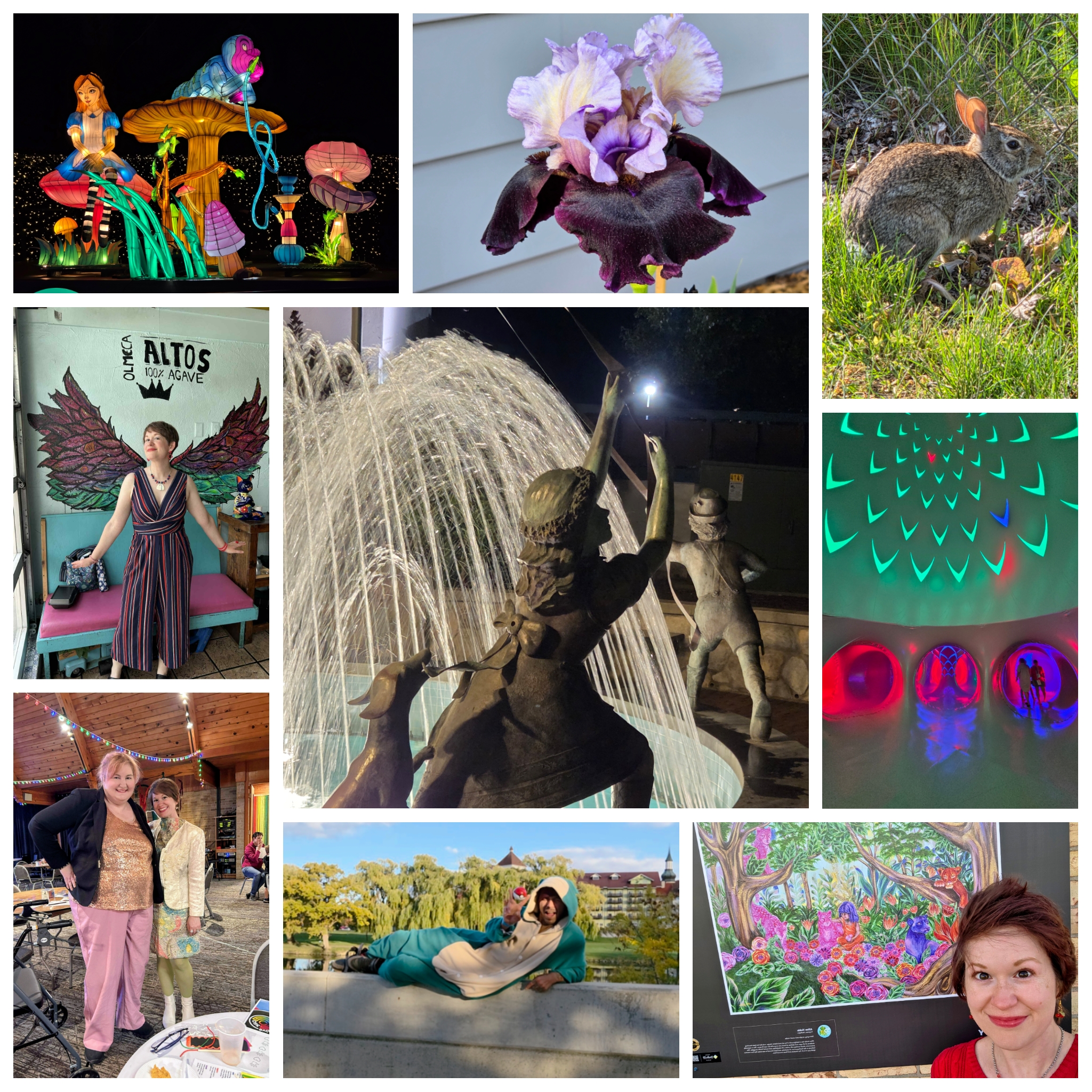
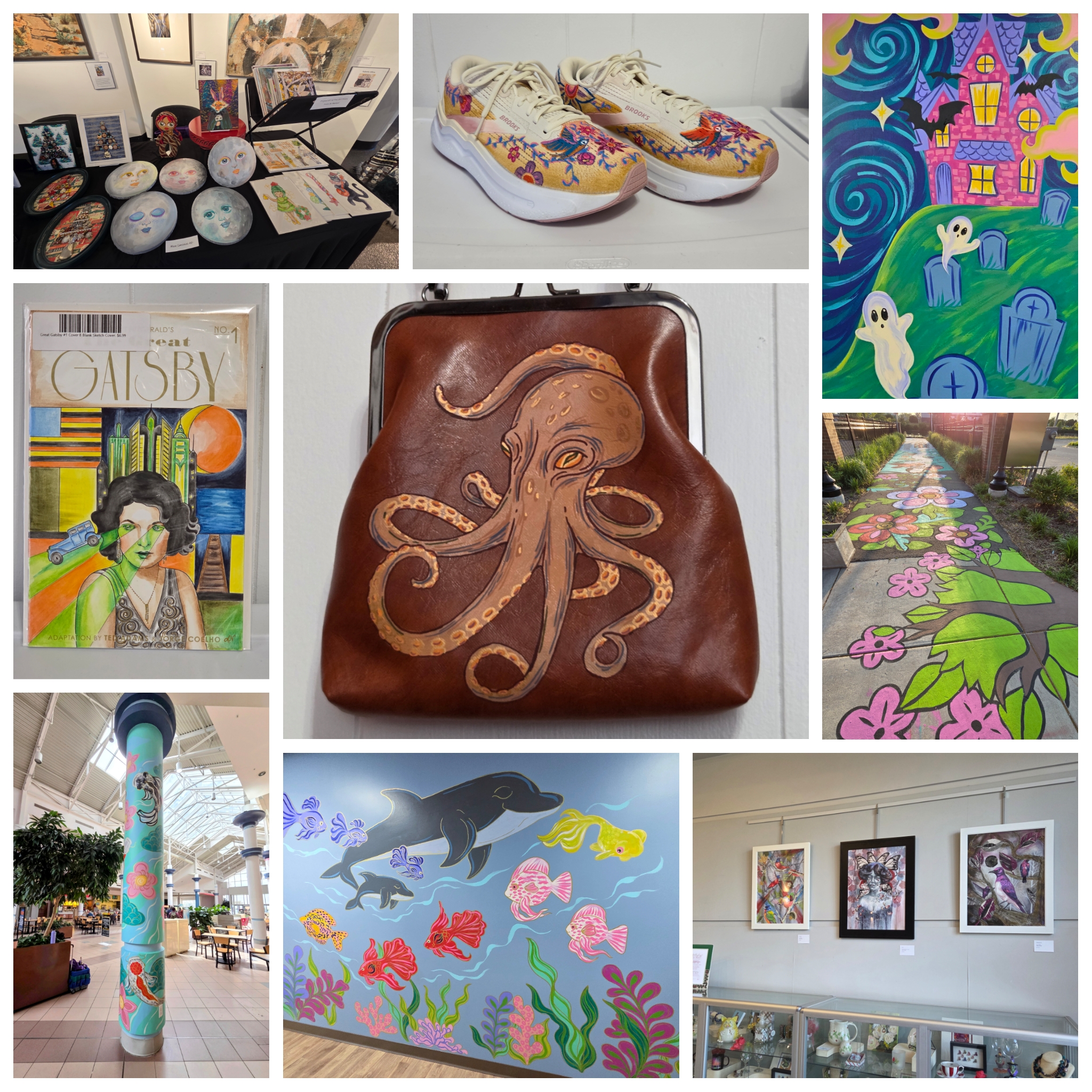
All of these artists’ work makes me feel excited and energized, but I think even more so than other artists are influences, I am influenced by snippets of individual images. I have always had a great memory for imagery, and tend to notice and fixate on interesting shapes, colors, and patterns nestled in my surroundings. I have been ‘screenshotting’ images mentally long before smartphones, and waiting for the perfect moment to retrieve that specific pattern on my mom’s old tin recipe box that she let me play with in my pretend kitchen as a toddler, the warm color scheme of polka dots on my Great Grandpa’s Mid Century Modern juice glasses he’d use to bring us Orange-Pineapple-Banana juice and Donettes when we visited, the crazy wallpaper I once saw at a friend’s house, the interesting tree I passed in someone’s yard while on a walk … All of this ends up in an internal slideshow gallery, a collection of beautiful and interesting things. This appreciation for visuals is partially innate I think, but probably also comes from my parents who in their own way also have an appreciation for beautiful and interesting things. Both love antiques. My dad is a collector, and he would always share interesting rocks, shells, and marbles with me from his treasures growing up. My mom, an avid gardener, would get excited about showing me interesting bugs, and I had all the most premium “insect hotels” to catch and observe them before releasing them back into the wild.
Inspiration comes from everywhere, and sometimes I wonder how a person can be alive and not be constantly inspired.
If you are reading this and have any questions for me as an artist, shoot them my way and I’ll turn your answer into a post, too!