Even though I’m no longer a frequent Instagram user, I still enjoy assembling my end of the year “Top 9” photo collages because if nothing else it is fun to look back on a year in pictures, one for life and one for art. This year, I found I didn’t have nearly as many photos to comb through because I had hardly taken any, aside from a lot of ebay inventory snapshots. This year was exciting and fulfilling professionally, but I’ll be honest it was tough, and I didn’t find myself with much energy reserve to enjoy the milestones. Flying by the seat of my pants, I guess there also just wasn’t ample time to capture the ride along the way.
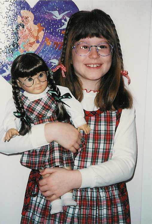
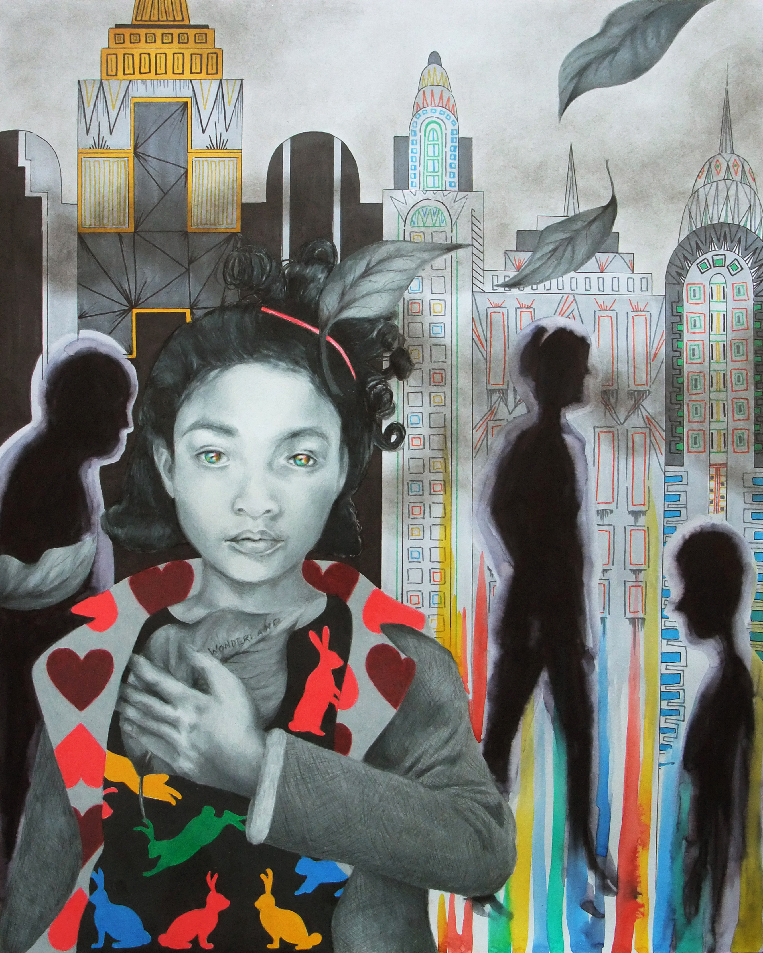
I have always been a bit extra-fascinated with personal photos. Back before digital and before everyone shared their photos online, sometimes you’d visit a friend or relative and they’d ask if you wanted to see their vacation pictures, snapshots from their birthday, etc. (aging myself here). A stack of newly developed photos or an album would be passed, the owner offering a verbal commentary along the way. In some this would elicit internal groans, but as a kid I was always happy to be a captive audience because I just loved looking at photos, anyone’s photos at all. Remember, I’m talking about pre-daily internet access. Looking at photos of different people and environments than what I was used to allowed me to soak in more visual details to use in drawings (and yes, even as a kid bits and pieces of these visual stories would end up in my marker sketches.). I distinctly remember that I wouldn’t just look at the main focus of a photo, but would scan the entire image methodically, taking note of what objects were sitting on the counter way in the background, what pattern was engraved on the button on one of the figure’s shirts, what type of knick-knacks were sitting on the corner shelf, just blurred out of focus. To me, these were important clues to the rest of the story, more so than the expressions on people’s faces.
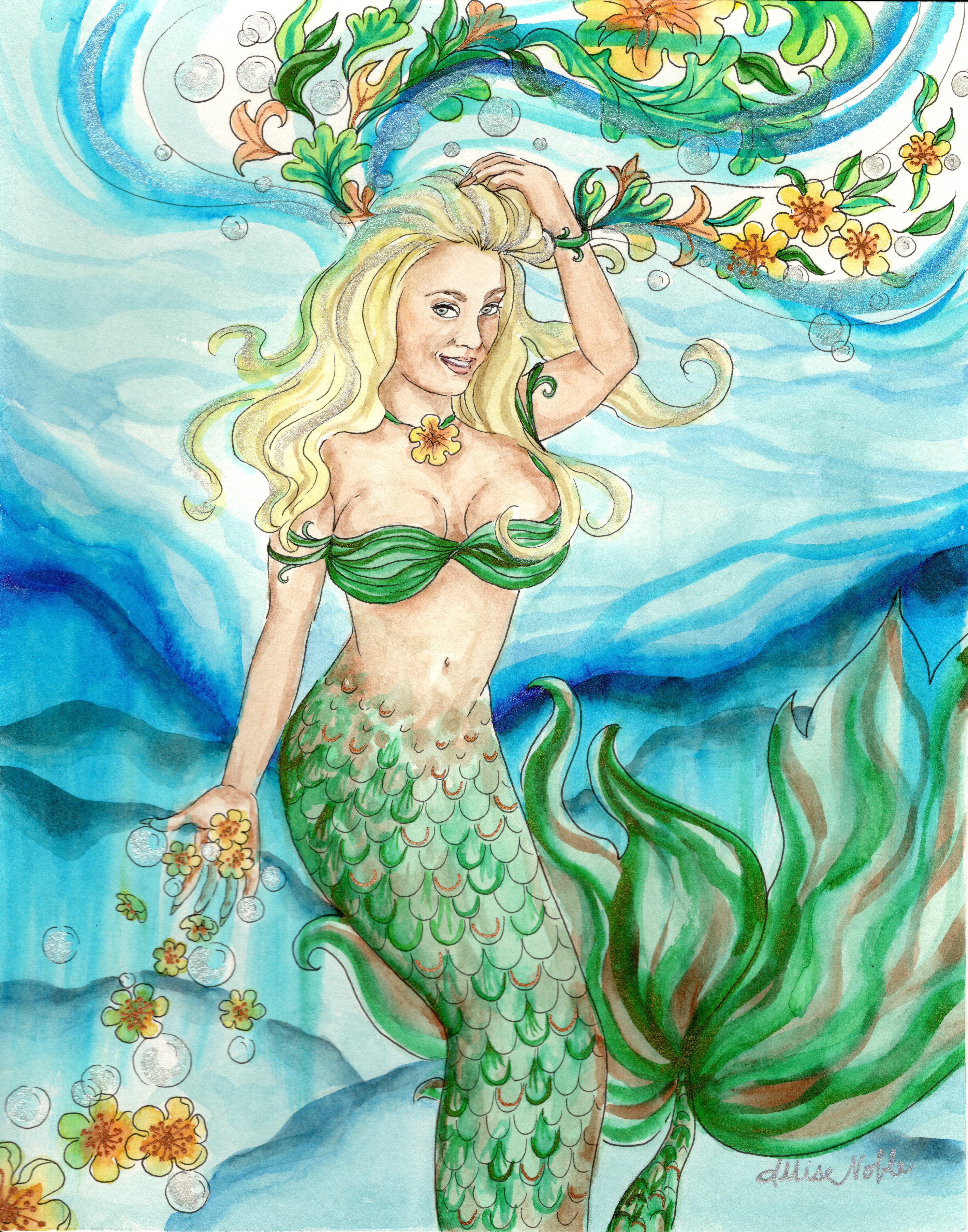
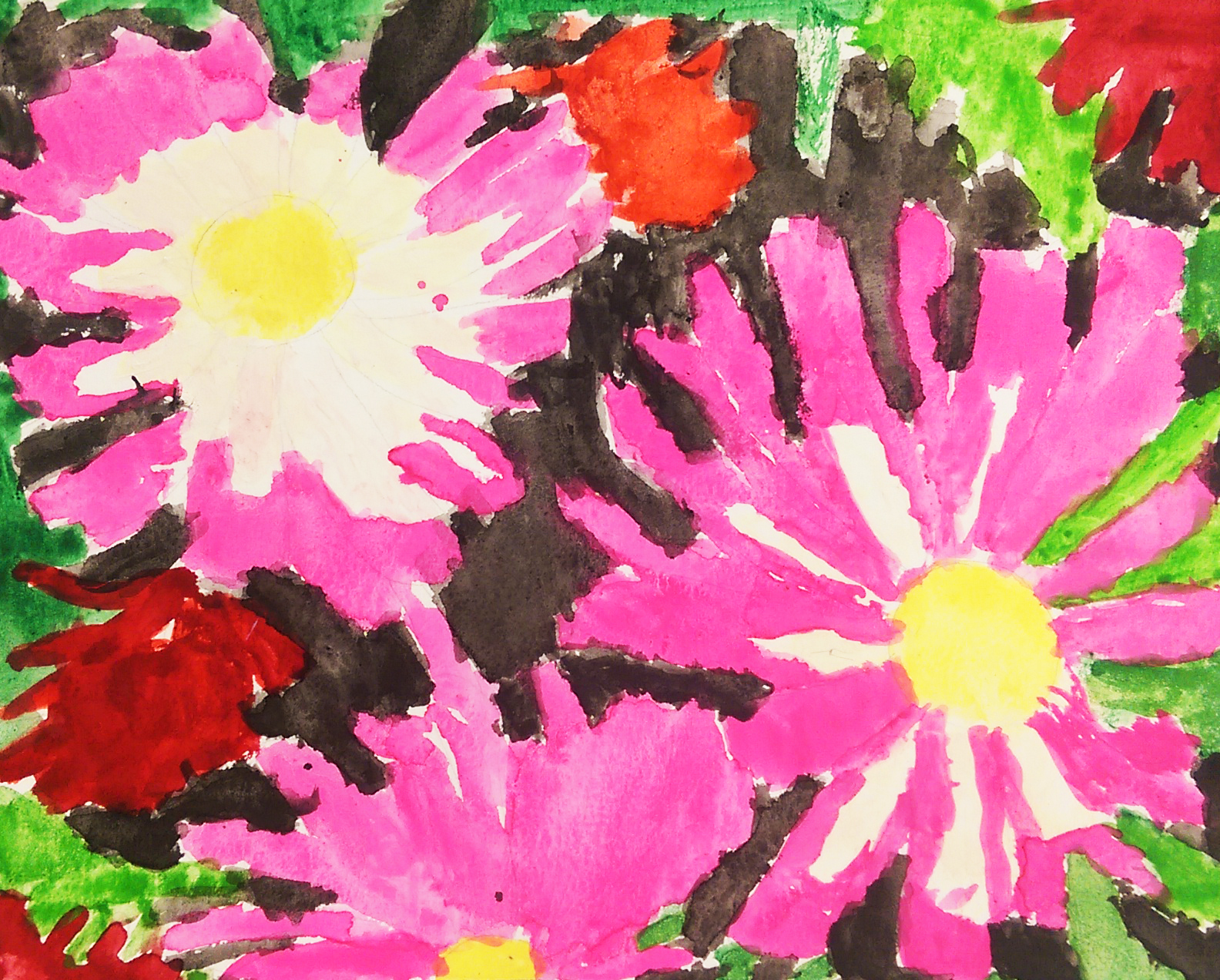
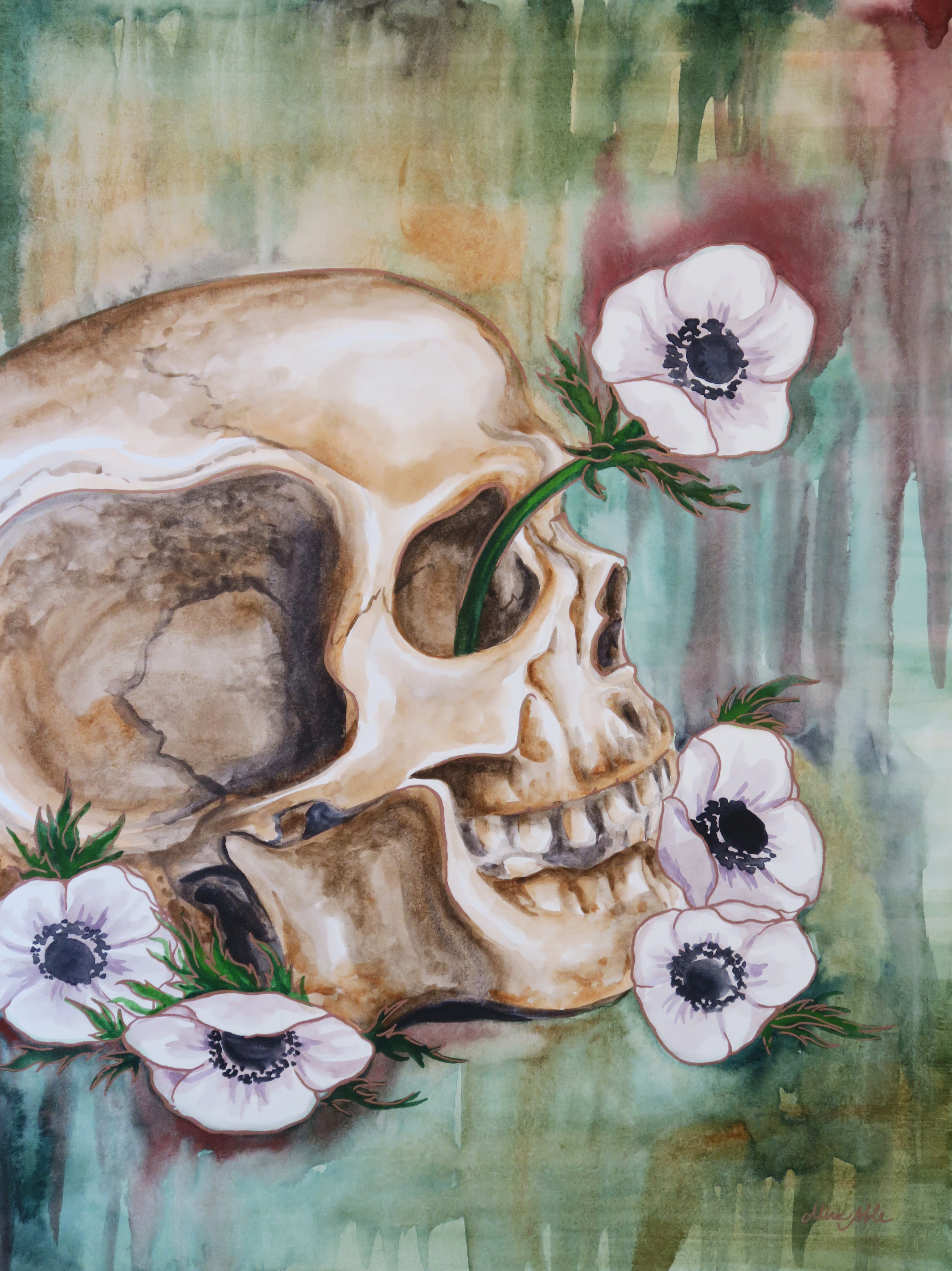
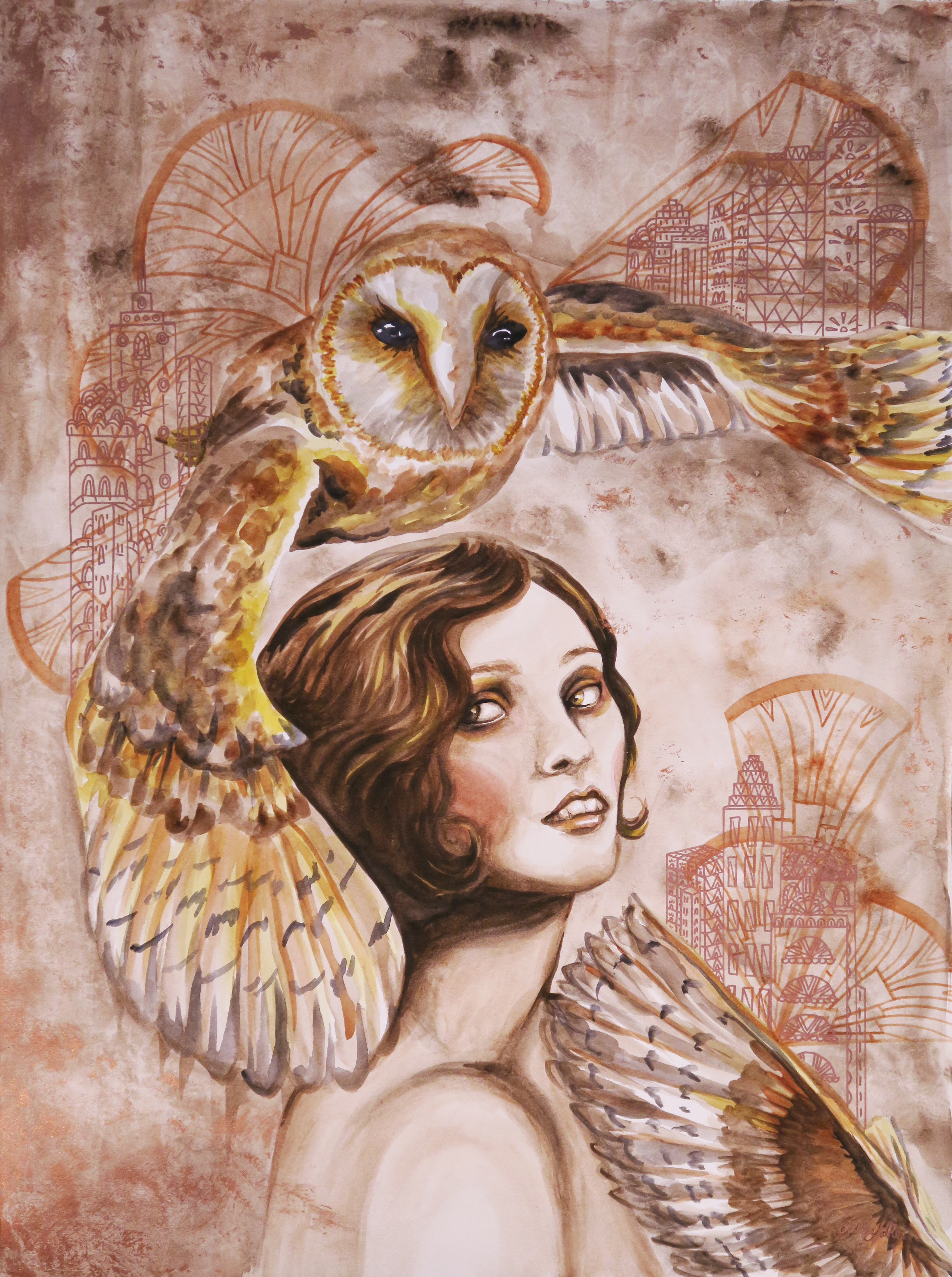
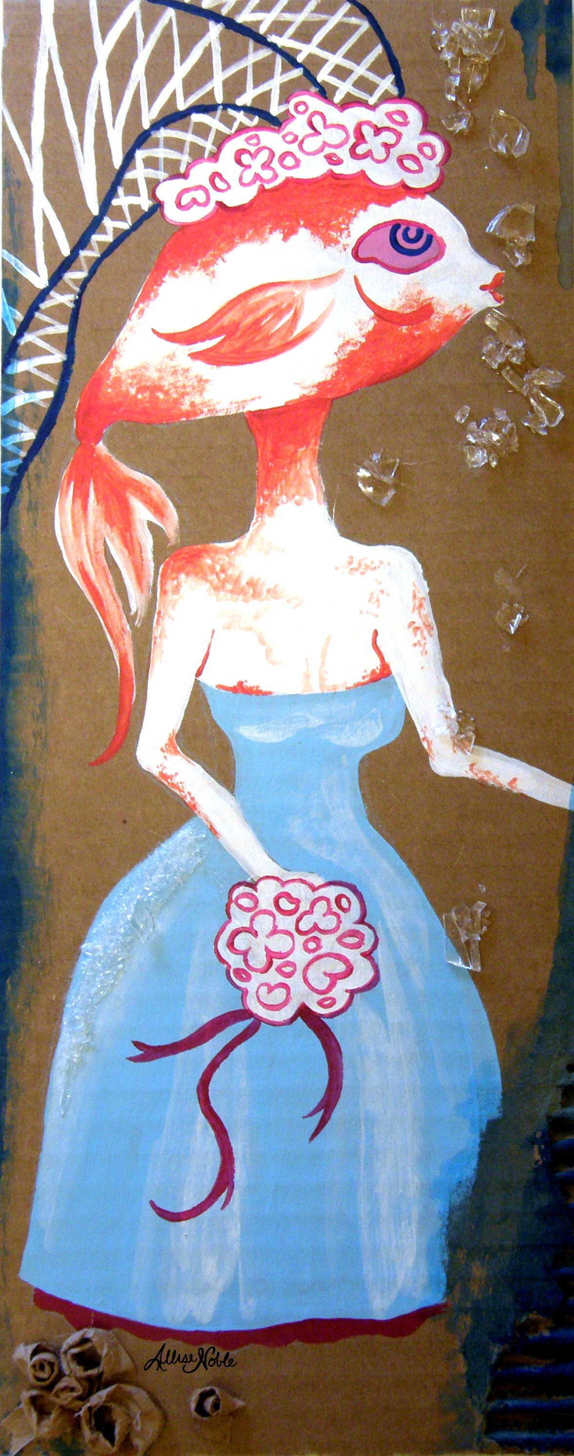
I still use that philosophy, that it is the small, overlooked details that reinforce a feeling and a story, in my art today. I am forever both physically and in memory collecting images to combine together to weave a story – a captivating fabric print here, an interesting nose there …
In a year as harried and chaotic as this one just passed, maybe what we choose to stop and capture says something about our story as well.