Art Discussion

Art Discussion – Legacy

Legacy, 11x14 Prismacolor Pencil

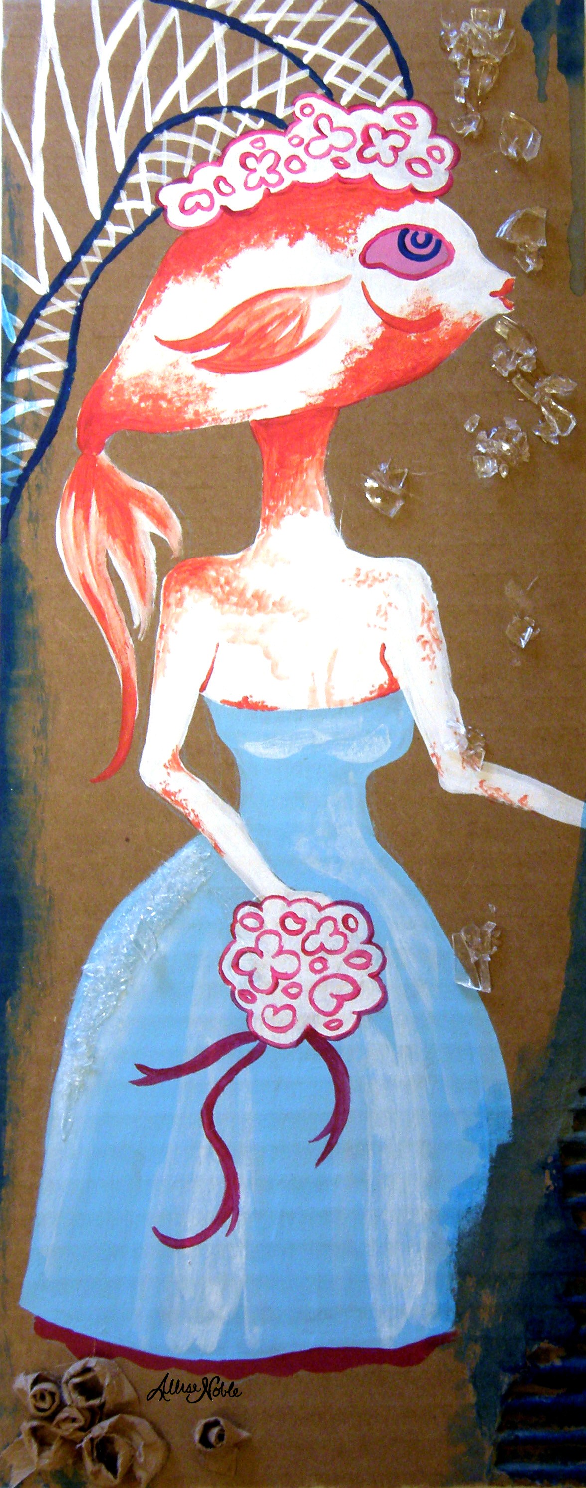
Legacy, 11×14 Prismacolor Pencil

Today, I wanted to unpack a piece from my conceptual portraits series I’ve been working on since beginning of last year, titled “Legacy”.

The script scrolling from her head at the top right reads “I fear being ordinary most of all”. For this piece, I had been thinking a lot about how many decisions we make are rooted in a fear of mortality. We fear that once we are gone it won’t matter… we will have left nothing behind to be remembered by. We long to be KNOWN for something, to be successful at something, for others to know our name. Sometimes we don’t even care if what we are noted for is positive or not, just as long as our existence is eye-catching and out of the ordinary and commands fame and astonishment for good reasons or for terrible. LIke Oscar Wilde said, “The only thing worse than being talked about is not being talked about”. Everything we do, in the relationships we build, the work and pleasure we choose, is leading towards a legacy we hope to build and the perception by which we will be remembered. I used the repeated pattern of the skull and grave markers on her clothing as a motif symbolizing mortality. You will also notice the burning city in the background at the bottom of the composition, which she turns away from smiling, so inwardly focused that she takes no notice of the external destruction.

I have always been interested in masks, mainly because I am interested in almost any form of art that involves faces. Masks can also symbolize so many different things. They can symbolize falseness, pretense, anonymity, invisibility, the concealment of sins. But, they can also symbolize celebration, personal expression, the fact that human beings are flexible and multi-faceted and shades of grey – not black and white, and the power we have over who we want to be in our own story. I am especially drawn to the aesthetic of Japanese Kabuki and Noh masks, two forms of classical Japanese musical drama that involve masks and elaborate costumes to aid in telling the story. In Noh, each mask symbolizes a different type of character. For the background of this piece, I chose to tile the demon character mask (destructive, powerful) alternating with the traditional woman mask (usually symbolizing a character who is beautiful, refined, elegant, and demure). This symbolizes the interplay between a person’s two choices (or more accurately, what we perceive as our only two options). Too often we think that the only way to get ahead, be noticed, be outstanding, is to forgo our ideals and do what is best for ourselves and ourselves only. Those who make history do tend to have an awful lot of skeletons in their closet. But does doing what is right condemn us to having to play the role of the mouse smiling and curtsying in the corner? I’d ask you to also look to history (Think of Martin Luther King Jr., the most well known example!) and see that no, that is certainly not the case.

It is always interesting to hear others’ thoughts. Who are some of your favorite notable figures who broke the societal assumption of power and success being inseparable from selfishness and violence? What kind of legacy do you want your existence to build?

Standard
Exhibitions and Other News

Wait, I Have Swag Now? There’s A First Time For Everything + New WIP

The Conceptual Portraits Collection

The Conceptual Portraits Collection

So, remember way back in the beginning of March when “I’d Have Been Happier As A Bird” was featured on RedBubble‘s front page? Well, one of the cool perks of that was I got a voucher to see some of my own designs in print, and I promptly ordered some greeting cards, a T-shirt, and a tote bag. I had been anxiously awaiting my fun packages trickling in (isn’t getting mail in general just the best, even when you’re expecting it?), and as of last week I received them all and wanted to share. I also have a new work in progress photo for an 18×24 conceptual portrait I’m working on, this time of a young girl rather than an adult which is something new. I tend to never take WIP photos, so appreciate it while you can! I’ll be sure to get better about that and share more of my progress as I begin new projects. I have quite a few idea sketches mounting up, so time to get to work!

Super cool T-Shirt in "I'd Have Been Happier As A Bird", and tote bag in "The Peacock"

Super cool T-Shirt in “I’d Have Been Happier As A Bird”, and tote bag in “The Peacock”

A little bit better lighting to truly see the designs ...

A little bit better lighting to truly see the designs …

Matching greeting cards! I was really pleased with how heavy they were, and with the sharp, high quality, gloss prints.

Matching greeting cards! I was really pleased with how heavy they were, and with the sharp, high quality, gloss prints.

"Wonderland" WIP

“Wonderland” WIP

Standard
Artists To Know

Artists To Know! Installment 3

Today’s Artists To Know Installment is all about faces!

Natalie Foss

I discovered this artist on Behance. She is a Norwegian illustrator who works mainly in colored pencil. I wish more magazines used interesting illustrations like these; I would subscribe to all of them just to save the pictures :). I adore how focus is brought to the faces of her subjects by making their skin the only three-dimensionally rendered element of a piece, leaving the rest flat and filled in with solid color or pattern. The unusual colors she uses also catch the eye. She makes blue toned skin completely believable by placing the undertones like pinks and yellows in just the right places. The faces have a reflective quality, and make the viewer believe they can reach out and touch them. I’ve truly never seen portraits quite like these.

Natalie Foss

Malinda Prud’homme

This artist I found on twitter via my newly created account (Look at me, getting with the times. @AlliseNoble if you’d like to follow :)), and was immediately drawn to her comprehensive range of portraits styles from photo-realistic to more stylized, in a variety of mediums. There are even three-dimensional mixed media elements in some of her pieces, like gems adhered to the surface of a subject’s jewelry rather than simply painting the ornamentation. It is rare for one artist to work in so many different styles, and they all look fantastic. On her website Malinda states, “My greatest passion is portraying a variety of natural female beauty in order to express that all women; regardless of age, size, style, or ethnicity; are beautiful in their own unique way.” – right on!

Malinda Prud’homme

Arisa Nakahara

I found Arisa Nakahara on pinterest. There is way more to pinterest than just recipes and cute wedding ideas – pinterest is another fantastic place to find some truly mind-blowing, excellent art. I love how most of Arisa’s portraits are painted straight on, and look you right in the eye. It’s a bit jarring and also captivating, especially since the eyes are the most detailed part of her faces. She says her theme is “The power to live”, and I can see that thread throughout all of her colorful portraits, saturated in lush fruits and floras and insects. All of her designs transport you to that magical warmth as spring and summer are just beginning. Her entire body of work is so cohesive and timeless, and the images, quite simply, make you incredibly happy.

Arisa Nakahara

Elsa Mora

Another artist I discovered on Behance (seriously, even if you don’t create art yourself it’s worth having a profile simply to browse and favorite all the amazing projects to be found here!). Elsa works in a variety of mediums including drawing and illustration and even extending into 3D mixed media sculptures and jewelry design, but I first found her through her paper cutting work. It is truly a testament to patience which I can never even imagine attempting. She creates whimsical storybook universes and achieves an unbelievable depth all with layered paper.

Elsa Mora

Lucy McLauchlan

I discovered this artist back in late high school when I still actually subscribed to magazines, and she was featured in an issue of Juxtapoz. Lucy McLauchlan is another artist whose work you can spot as hers from a mile away. The combination of heavy black and white contrast and the balanced flow of designs made entirely of undulating lines and stylized faces is hard to look away from. I would love to walk around in this place (and maybe have my bedroom painted like this, hm?)

Lucy McLauchlan

Ruben Ireland

Another artist who favors dramatic black and white contrast, Ruben’s art is one more find from pinterest. He uses the black and white to divide elements of the body and draw out or recede features into the dark. He seamlessly weaves animal and woodland/nature imagery through his portraits as well, forming almost a psychic connection between the two. His subject’s facial expressions are ambiguous and stoic, leaving you to look to other cues to imagine what is on their mind.

Ruben Ireland

Are there any other types of artists or artwork you’d like to see? Let me know! I’m always open to suggestions!

Standard
Artists To Know

Artists To Know! Installment Two.

James Jean

James Jean is a double threat Taiwanese American artist – known equally well for both his commercial (DC Comics, ESPN, Prada, and Atlantic Records to name a few) and fine art gallery work. I know James Jean most from his arresting illustrations that grace the covers of Bill Willingham’s “Fables” graphic novel series. I am not one to ever keep up with series, but I cannot stop adding more of these books to my collection. Not only is the art obviously exquisite, but the stories are gripping, and the very reason I just cannot get into that “Once Upon A Time” TV show everyone is freaking out over – Same idea, but “Fables” is just so much better. Jean’s illustrations range from the ultra colorful to the monochromatic as featured below, but they all have a transparent, ghost-like quality to them that is just made for depicting fantasy characters, not fully “real” themselves. His website features a lot of his non-fables work, which was fascinating to see since I wasn’t as acquainted with it.

James Jean

Madge Gill

Madge Gill is not a current artist, being born in the late 1800s and passing in 1961. Though I usually highlight artists still working today, her primitive ink drawings drew me in the moment I first saw them. One of my workplaces had a couple-month-long focus on outsider art over the fall, which prompted me to want to learn more about the genre. Outsider art is literally art created by outsiders or untaught artists, art created outside the boundaries of official culture. I watched a documentary about outsider artists on youtube one evening, and Madge was one of the artists highlighted. She had a life filled with more hardship than many have to face. After delivering a stillborn child in 1920, one more painful life event, Madge claimed she had become inhabited by a spirit guide named Myrninerest. This connection continued throughout her life, and she would often go into trance like states, withdrawing more and more into herself. Though her detailed drawings of characteristic females; most of which took her only minutes at a time; continue to captivate viewers, it seems she never found peace. Near the end of her life, even her art-making had become a burden, more an obsessive-compulsion than a therapy. The biography on her website asks, “Are these in a sense self-portraits, or rather: attempts to stabilize her own fragile being, as it were through fleeting snapshots? Another reading equates the faces with Myrninerest, envisaged as the artist’s otherworldly alter ego, immune to the traumas of actual life.” (In the documentary, I noticed the alter ego’s name was pronounced as “My inner rest”, which would seem to suggest that the alter ego created as an escape or explanation for behavior she could not control is a plausible hypothesis). Her story is a sobering realization that although art helps us in coping with difficult emotions and can be a vital form of self-expression to those whose voices are stifled, creation alone is sometimes not enough, especially in isolation.

Madge Gill

Yayoi Kusama

I first saw Yayoi Kusama’s work at The Mattress Factory on a school trip to Pittsburgh (shown in the photo below). Though I wasn’t familiar with her at the time, this installation was my absolute favorite. Same as with Madge Gill, I learned about Yayoi Kusama through my outsider art documentary binge. A clip of a similar installation to the one I saw was shown in the film, and I suddenly realized “Oh my gosh, I’ve walked around inside her work before!” Also similar to Madge Gill, Yayoi Kusama has wrestled with psychological issues throughout her life, though her story has a far happier ending. Kusama began creating art with polka dot motifs as early as 10 years old, one of her first pieces a drawing of her mother with dots emanating from her portrait (Her mother was physically and emotionally abusive). She also began suffering hallucinations at an early age, seeing these dots everywhere, flowing towards her, in her own words trying to “obliterate” her. To date, many of her works include the words and themes of “self-obliteration”. In 1973, she checked herself into Seiwa Hospital for the Mentally Ill and still lives there to this day by choice, her studio nearby. Kusama has reached out, and come to enjoy the residents and staff and art continues to be a source of joy and purpose in her life. A creator of all trades (and master as well), she creates paintings, sculpture, installations, clothing and accessories, fashion editorials, films, and poetry and short stories all cloaked in her trademark surreal, ultra colorful, polka dot covered world.

Yayoi Kusama

Yayoi Kusama

Martine Johanna

Martine Johanna is a Dutch artist who started out in fashion design, but left the industry desiring more freedom to devote to her own work. The fashion influence is evident in her figure’s pose, gaze, and design. What I love most is how she sometimes leaves areas of pieces less developed to draw the viewer’s eyes to where she wants them to rest. If you look through the rest of her work as well, you will also see how she uses bold, bright colors you wouldn’t think of using for skin tones like blues and yellows to render her figures’ flesh. Bringing these natural undertones to the forefront gives her work an otherworldly quality that it is impossible to look away from, and highlights her imaginative nature.

Martine Johanna

Arabella Proffer

Google+ is a great place to discover artists as far as social media goes, and that is where I found Arabella Proffer. She was born in Ann Arbor, Michigan (woohoo, shout out to my home state, where I still reside) and now lives in Ohio (second shout out to where my parents are from and where most of my extended family still lives. I guess some cool art CAN come out of the midwest, huh?) – I thought that was pretty cool. Her work combines old school, aristocratic portraiture with pure 1980s punk rock and gothic culture. She also has an interest in medical history, remnants of which find their way into her work. The contrast of all these elements creates a tension that makes me want to get to know the fabulous women in her pieces, sit down and have a cup of coffee with them in their imaginary, velvet curtained living rooms – they all seem like so much fun.

Arabella Proffer

Standard
Project Ideas

No Canvas, No Problem! – Using Unexpected Materials

I first discovered my love of corrugated cardboard when the movie “The Science of Sleep” came out. If you haven’t watched it, it’s an extremely visually fun movie and you should check it out. If you have, the various imaginary cardboard-based sets depicting the main character’s dream worlds, such as the car chase sequence or the cardboard cityscape, attracted me to corrugated cardboard’s simple, whimsical, DIY charm. I started using it for projects in college not only for the charm itself but for utilitarian reasons. After having to buy so many canvases and large pieces of illustration board for studio assignments, by the time I got around to my own personal projects I simply didn’t want to have to buy another damn thing! It was light and easy to transport for painting outdoors on nice days, and was readily available at no cost.

Cardboard also offers more easy textural options than canvases simply by layering or ripping away at its surface. Tearing away at the cardboard’s outer layer reveals the interesting ribbed texture beneath to be used as a design component. Layering torn edges automatically gives your piece an industrial, time weathered feel like the monochromatic cityscape below. Scraps can even be used to roll, crinkle, and fold 3D elements, such as the rosettes at the bottom of my fish bride piece. There is a story to this one; my roommates and I had 2 feeder goldfish we rescued from the tank at the grocery: Mr. Mustache and Mistress Bouffant. This is why I don’t have pets. Even the death of this tiny, normally dinner to bigger fish, goldfish caused distress, and I decided I needed to immortalize her. I used broken glass as bubbles due to the clear, reflective nature of the pieces. I still remember smashing bottles with a hammer on the front porch of our apartment. A neighbor asked what I was up to, to which my quick answer was, “Our fish just died.” I only realized in retrospect how that must have appeared, me furiously hammering away with that statement as my only explanation. No wonder they were never too chatty with us.

I’ve included some photos of my own experiments as well as some cardboard art by other artists as inspiration. The next time you get a package in the mail and have some extra cardboard laying around, I’d encourage you to give a project like these a try.

RIP Mistress Bouffant, Mr. Mustache will morn your absence. (A side note, the other goldfish really did have a black marking above his lip that looked exactly like a drawn on mustache.)

RIP Mistress Bouffant, Mr. Mustache will morn your absence. (A side note, the other goldfish really did have a black marking above his lip that looked exactly like a drawn on mustache.)

Painting on layered cardboard, using the texture of the corrugation as part of the design.

The flawless, traditional black and white portrait contrasts with a work surface left rough; with dents, tears, and even leftover paint smeared here and there as if the artist was cleaning off their brush.

Valery Koshlyakov – High-rise on Raushskaya Embankment (2006) – Tempera on Cardboard

Retro Barbies, acrylic on cardboard

My retro Barbies, acrylic on cardboard

Standard
Artists To Know

Artists to Know! Installment One.

In my first installment of Artists to Know, there are actually two digital artists, still unbelievably underrepresented in this day and age. Digital artists are highly under appreciated, and wrongly viewed as art “cheaters” in the fine art world. I myself have played around with digital work, and absolutely HATED it! Take it from me, what one can do in 10 minutes with a brush seems to take 10 hours on a computer. Digital art is used to achieve a desired effect, it is by no means a shortcut. I hope you see something new today, maybe something that sparks ideas of your own.

Ray Caesar

Ray Caesar describes his art on his website as “facing something unpleasant with calm and looking beyond what you’re viewing to see the beauty within”. His work is influenced by the time he spent working as a photographer and graphic designer at a children’s hospital, many of whom were abused or suffered from serious physical deformities. After his mother’s death, he had a dream in which she appeared to him as a child. The childlike figures in his pieces aren’t really children but the manifestation of people’s souls. His work is certainly not for everyone, and I know many who find his art too  creepy or disturbing, but it goes to show that as artists, our experiences do inform what we create. He uses digital programs to create a 3D world in which he can change poses, adjust the viewpoint angle, open and close drawers … He has said there are hidden secrets that never show up in the prints such as what are in the figure’s pockets or inside closets. If you have the time, read more in depth about the process by which these digital worlds are created because it is truly amazing and eye-opening.

Ray Caesar

Catalina Estrada

This lady does everything – Besides the typical art prints, she covers greeting cards, bedroom comforters, clothing and bags, even umbrellas with her beautiful designs; prints wallpaper; has her art made into difficult 1000 piece puzzles that I would probably end up throwing across the room in frustration! She embraces the concept that art doesn’t just have to hang on a wall, and captivating designs that make people smile and feel inspired can cover every imaginable surface. She makes her work accessible, and that is awesome.

Catalina Estrada

Elena Kotliarker

From the Ukraine, Elena classifies her work as Judaic Art. The flow from one element to the next in her pieces is so spot on, the effect is calming and dynamic at the same time. I love all the tiny details within each piece, so that you keep noticing new things the longer you look at it. Also interesting is the cultural symbolism she integrates into each work. I discovered her on ebay actually, and now have a gorgeous little ACEO prints as a souvenir.

Elena Kotliarker

Camille Rose Garcia

Camille Rose Garcia is an artist you can spot immediately. I love that all her art just GOES TOGETHER to form a cohesive body of work based on her distinctive style alone. While maintaining this continuity, she continues to keep things fresh and different with widely varying genres, stories and narratives, and color schemes. Much like Ray Caesar, I feel like her work is something you get or don’t. Being the fan of almost any form of surrealism or warped storybook illustrations that I am, I am in love.

Mia Araujo

Mia Araujo is interested in the complexities that make each individual unique, and the invisible universes that thrive inside us all. Manifesting inner landscapes through art, making the invisible visible, is something I am also passionate about as I touched on in my last post. It’s no surprise why I am so drawn to her work. Each piece has an entire fantasy story within it to absorb. For lovers of portraits, you’re in luck, because within each piece are embedded innumerable portraits, from the main subject(s) to the tiny faces embedded in the background and sometimes even within the subject’s hair or clothing. Can you tell I’m into detail?

Mia Araujo

I hope you’ve enjoyed exposing yourself to some artists you may not have heard of before. I did go heavy on the surrealism as that is what I tend to be drawn towards most, but even if the subject matter or style is not your bag, there is always something to learn by observing other artists’ technique. I’m constantly finding new artists and images that inspire me, so I will definitely be sharing more in the future – be on the lookout!

Standard